PureHarvest introduced Australia to the benefits of non-dairy milk back in 1981 and have never stopped pushing the industry forward with organic, whole ingredients to make products that taste and feel good.
Despite the long history in the market, PureHarvest didn't command the lead in sales and was seeing other competitors leapfrog ahead of them with cheaper products that used a range of imported, powdered ingredients and less innovative approaches. PureHarvest constantly ranked high in preference for flavour and texture, and those who chose the brand were particularly loyal consumers. The issue was that the brand was lagging behind its competitors in terms of growth and was often carving out new product niches that imitators were then overtaking. PureHarvest asked Fluid to review its brand strategy to get to the root of the problem.
Solution
Starting with brand research, Fluid built a comprehensive view of where PureHarvest sat in the marketplace. The team segmented audience research using cluster analysis to define key audience segments. Fluid used distinctive asset research to understand how often consumers could correctly identify PureHarvest products and then compare that to the competitors. Finally, the pairing with media partners, Fluid was able to analyse the audiences and show in what geographies the brand under-indexed where the most ground was to be gained.
Armed with the best view of the marketplace they've ever had, PureHarvest and Fluid realigned the brand under a new brand positioning relevant to their audiences, distinct from their competitors and that they knew they could deliver on.
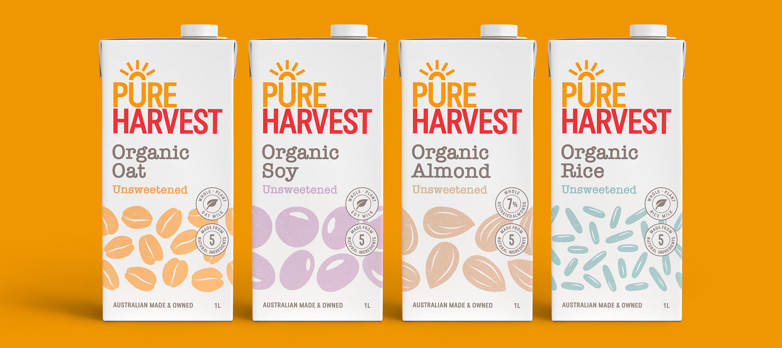
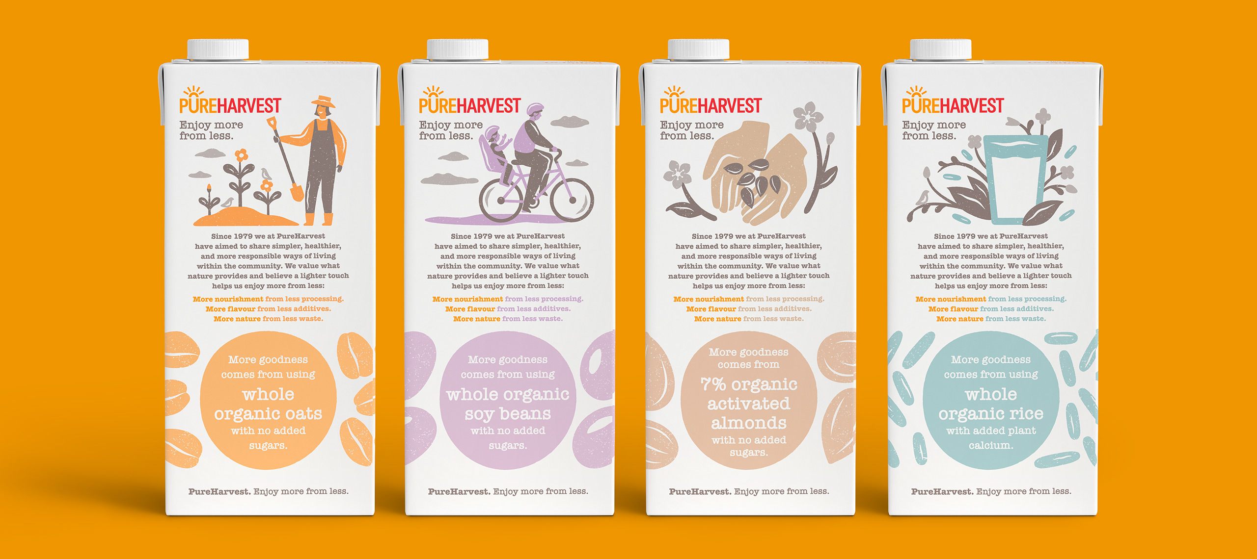
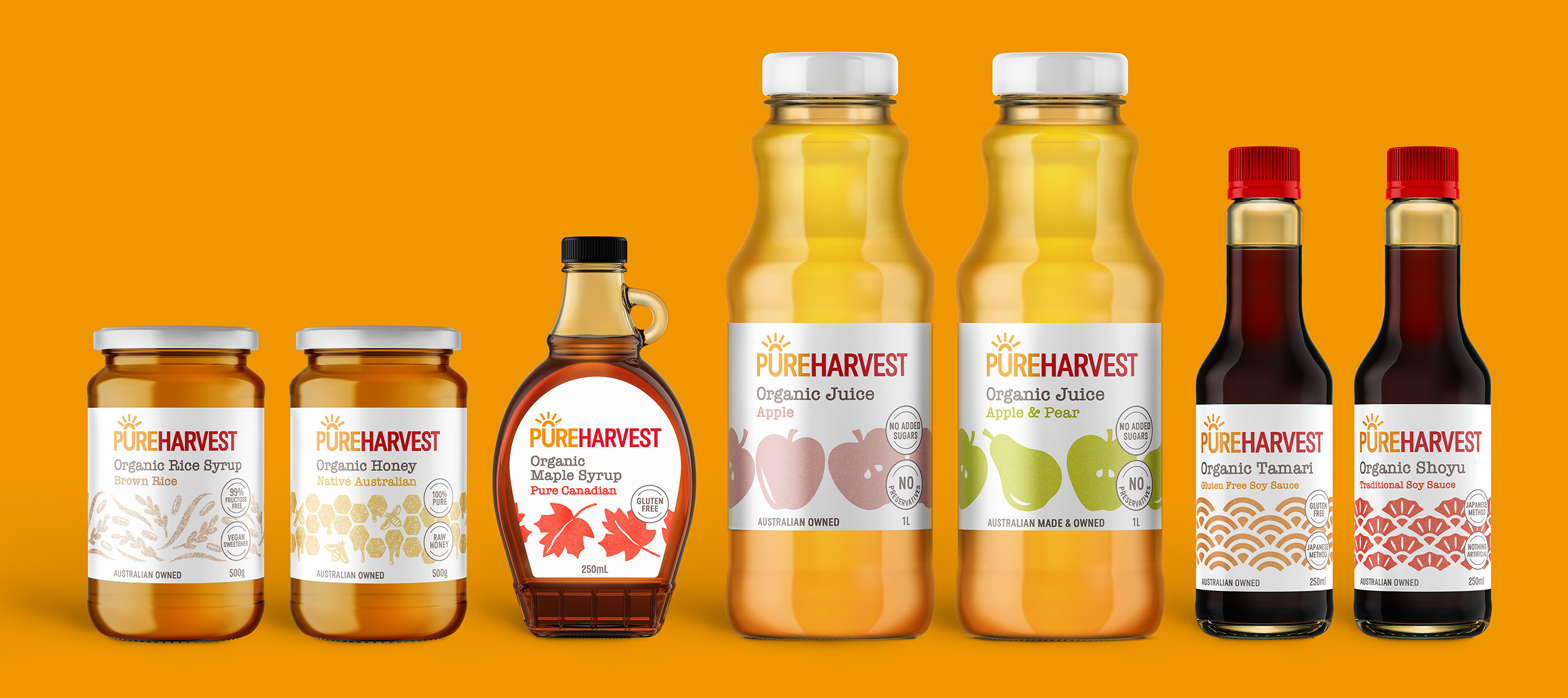
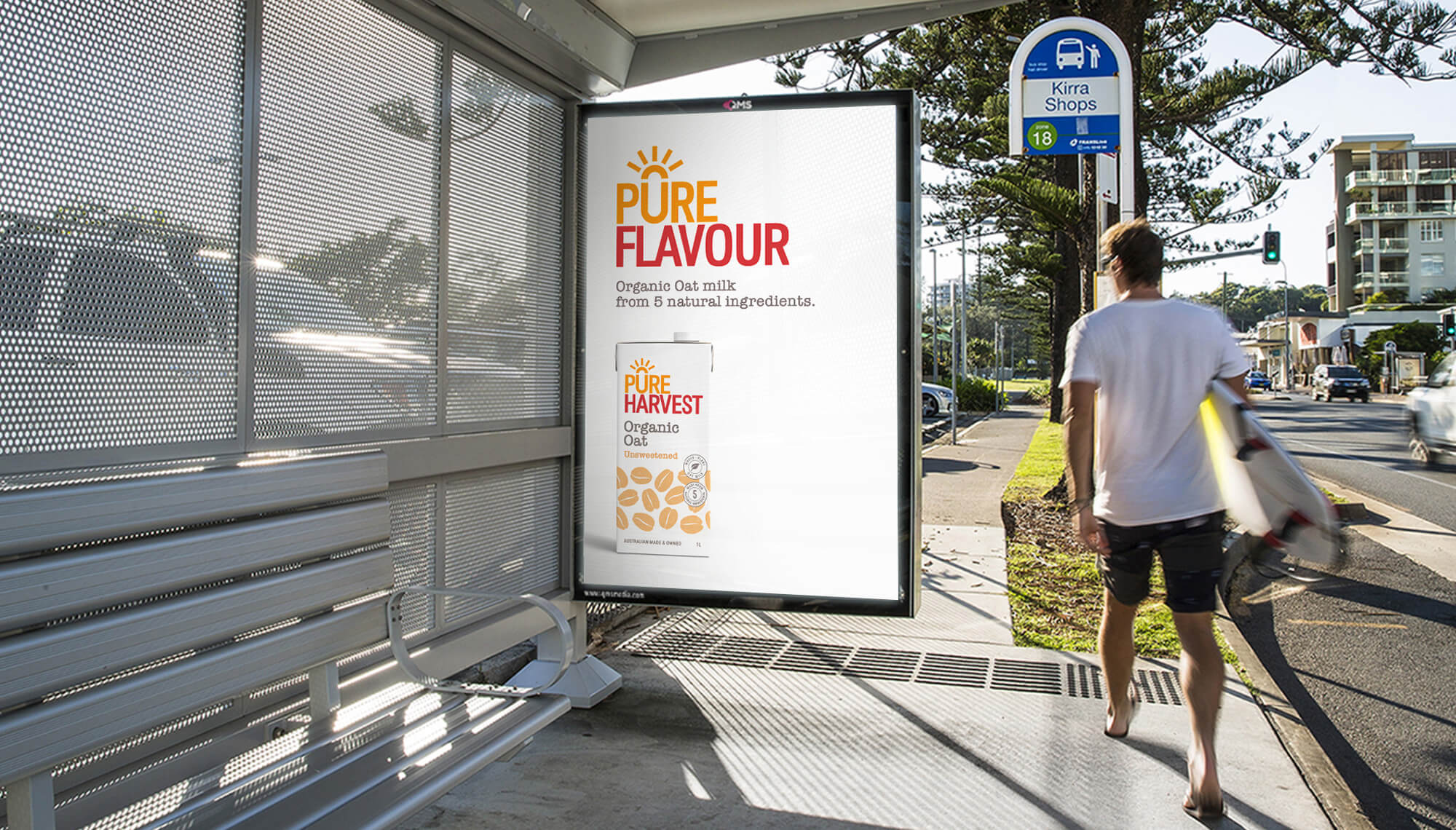
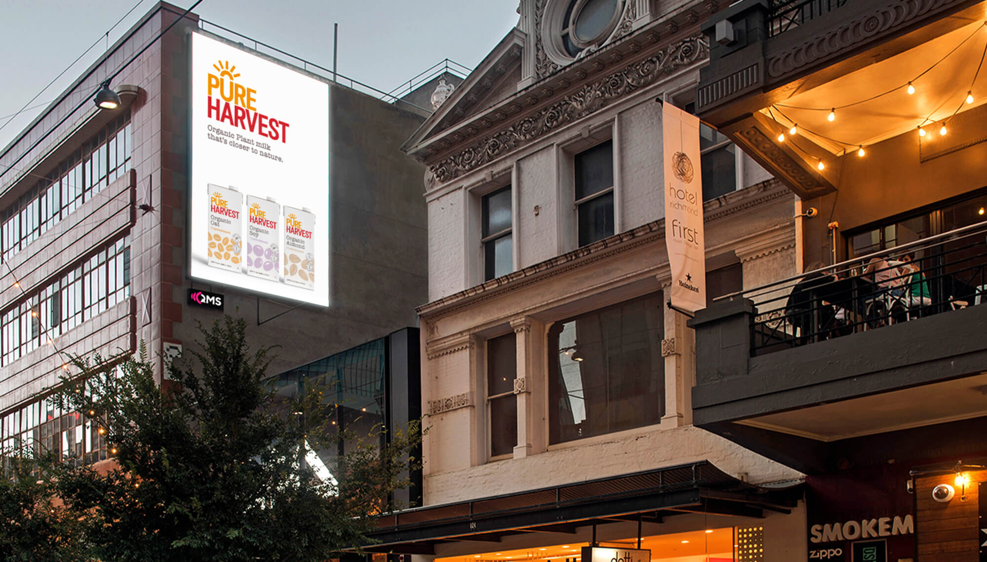
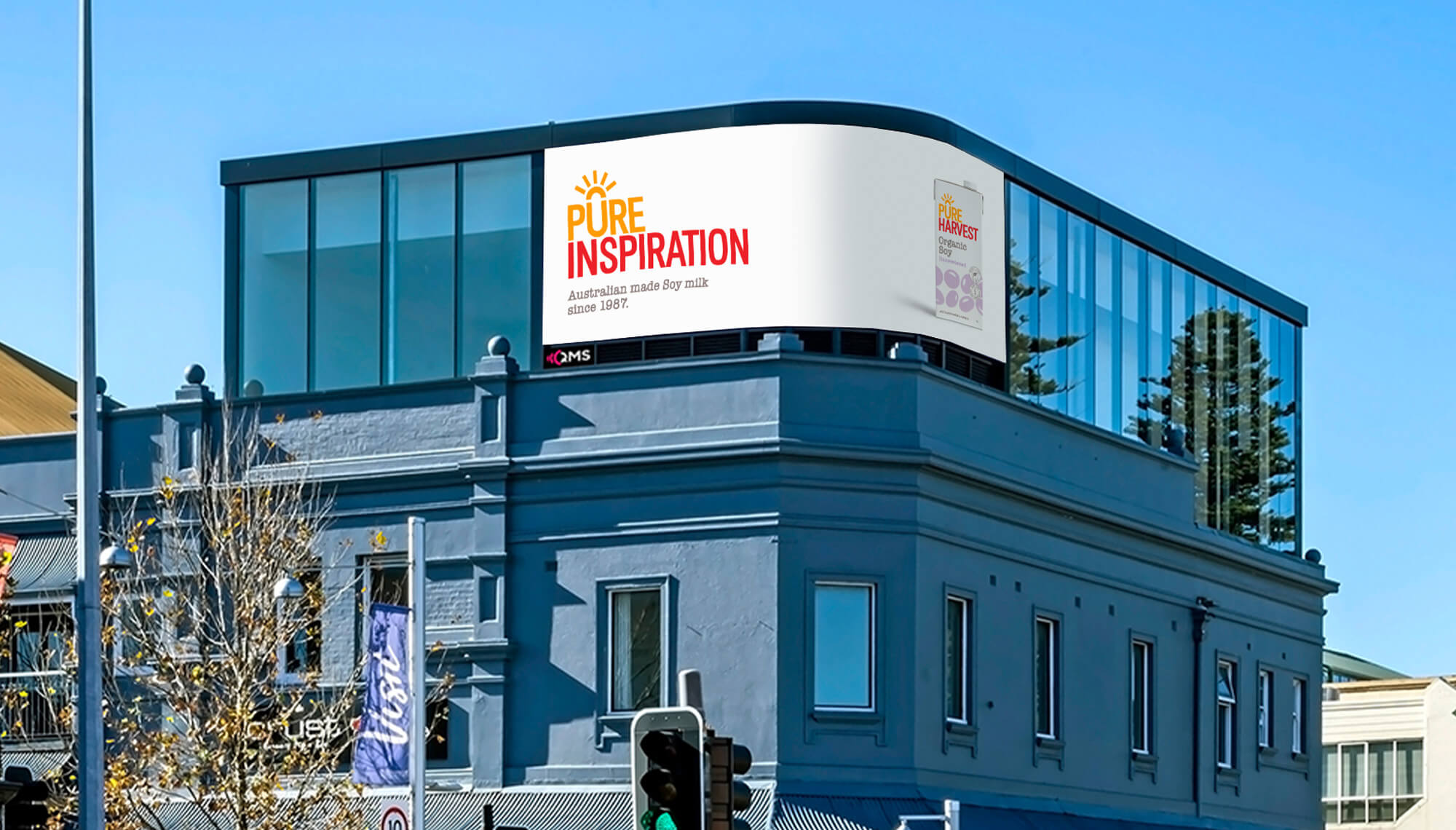
The brand positioning inspired several changes, including a new strapline 'Enjoy more from less' and a new look and feel for the complete range of PureHarvest products.
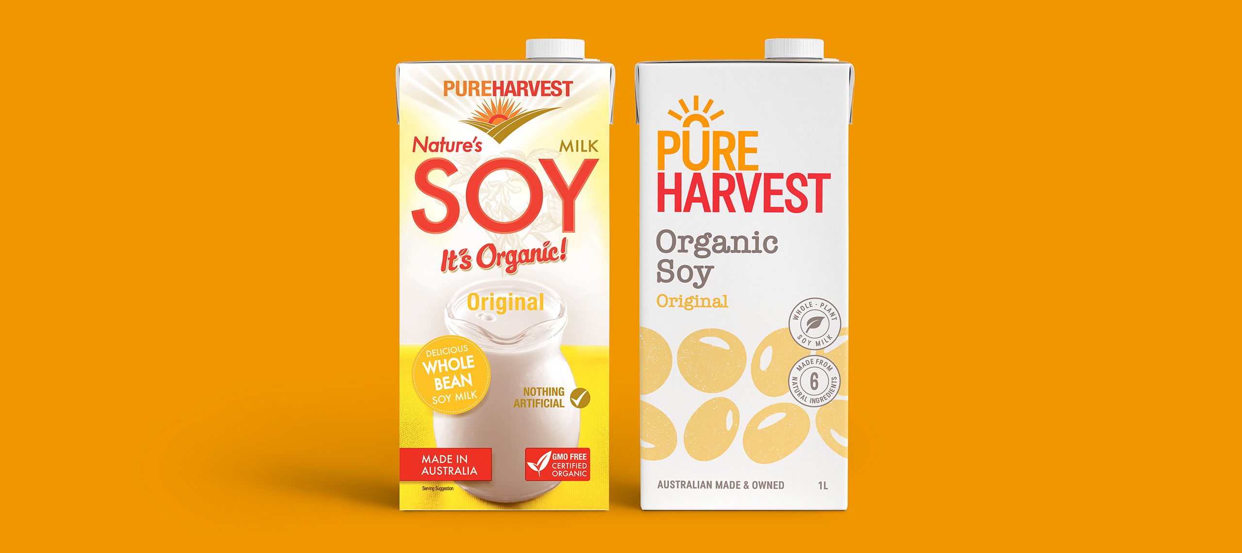
PureHarvest's packaging would now focus on using a range of new distinctive brand assets that could link across communications, pack and advertising. A large, strong logo that used the most distinctive elements of the old packaging was paramount, followed by an iconic illustration style that would make the brand block together in the way it had never been able to before. Fluid addressed the brand architecture, creating for the first time in the brand's history, easy-to-navigate ranging.
With the packaging component complete, Fluid turned its attention to launching the brand. Significant changes in the packs meant a need to push the new distinctive assets and engage people with a message that all the research said would appeal to them: A pure Australian brand, made with pure whole ingredients.
Outcome
The new brand, packaging and campaign spiked interest across the board. Despite the major changes, the new pack's pack recognition actually increased. The brand enjoyed increases of 42% in unaided brand awareness and 55% in consideration rates. Website visitation increased by 30%, and the brand was exposed to over 6 million audience members in new territories where the brand had previously under-indexed.
Deliverables
– Identity Design
– Digital Design
– Campaign
From the first moment we started working with Fluid it was clear that they were invested in our brand and what we were trying to achieve. They took the time to carefully understand our business – our history, the markets we operate in – and always treated our mission with passion and respect.
Throughout the process, from articulating the brand strategy through to rolling out the re-design on packaging, Fluid was always open and receptive to any thoughts or concerns we might have, but never afraid to push us to consider new perspectives.
With their expert guidance, we formulated and executed a clear redevelopment plan, one that recognised and respected our past, but wasn’t afraid to make the necessary changes for our future.